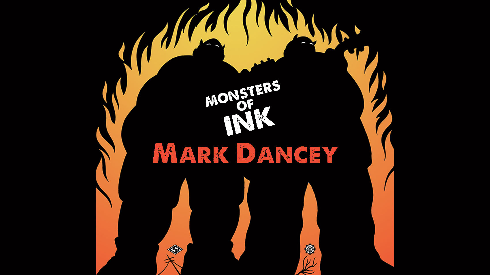
Monsters of Ink is a new series where we talk to some of the artists and designers, both legends and legends-to-be, whose contributions define the visual language of modern music. Without these tireless screenprinters, typographers, and obsessive stipplers, our archetypal image of rock ‘n’ roll would probably just be a bunch of dweebs with guitars and flannel shirts, and records would just be indistinguishable pieces of plastic. These hunched-over heroes lend unforgettable visual compliments to the music in the form of posters, album covers, t-shirts, and who knows what else, and usually for a fraction of what Kanye West has made since you started reading this paragraph. We at Riot Fest can’t make them that much richer, but if we can make them just a tiny fraction more famous, well, at least it’s something.
MARK DANCEY…
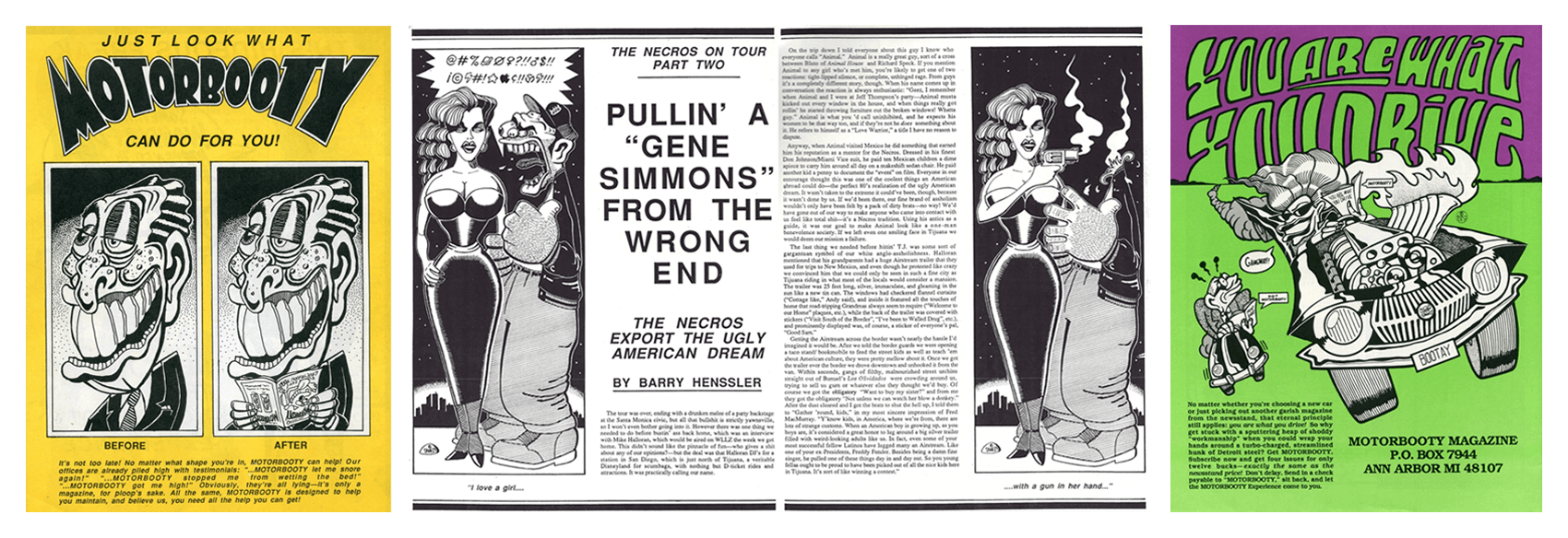
went to school at the University of Michigan in Ann Arbor, where he worked on the staff of the school’s humor magazine, the Gargoyle. It was there that he made the friends, and learned many of the skills, which would eventually lead to the publication of Motorbooty, an uproarious, we-publish-when-we-feel-like-it punk/prank magazine whose tone fell somewhere between MAD, National Lampoon, ZAP Comix, CREEM, and Slash. With Motorbooty, Dancey — along with fellow subversives Danny Plotnick (also a filmmaker, creator of primo no-budget trash like Skate Witches and I’m Not Fascinating: the Movie), Mike Rubin, Barry Hennsler, and a grip of others — cut a colorful, gonzo figure against the largely monochrome world of punk fanzines, eventually exerting influence over everyone from SPIN (for whom Dancey and Rubin eventually did freelance work) to the Beastie Boys (whose own 90s zine, Grand Royal, was often written off by those in the know as a watered-down Motorbooty). A book collection of the magazine’s nine issue run is massively overdue (We’re looking at you, Third Man Books!).
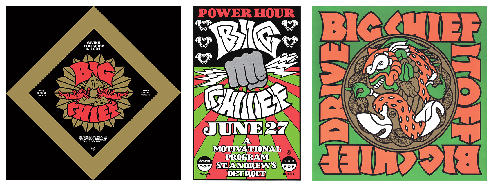
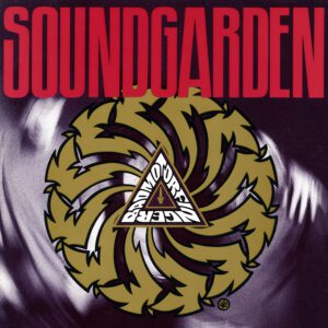 During most of Motorbooty‘s 1980s-90s reign, Dancey also played guitar with Detroit riff-rock miscreants Big Chief, all of whose members contributed to the magazine to some extent, and all of whose releases served as an exhibit for Dancey’s bold and bright visual style. It was through Big Chief that Dancey befriended Soundgarden, a friendship which lead to his most widely distributed work, the cover of that band’s benchmark album, Badmotorfinger.
Dancey still lives in Detroit. Nowadays, he spends most of his time painting, though he’ll still come out of the woodwork occasionally to do poster and album work for select clients, including Danny Brown, Negative Approach, and even muscle-rock legend Thor.
CLASSIC INFLUENCES, MAN
MARK DANCEY: There was a guy, Kevin Plamondon [early employee of renowned rock poster seller Artrock who later co-founded Man’s Ruin with Frank Kozik], who lived in Ann Arbor around the time we were starting up Big Chief. He encouraged us to do limited color posters, because he’d seen what that had done for all those old Fillmore posters and stuff. He even introduced us to [legendary psychedelic poster artist and John Sinclair/MC5 co-conspirator] Gary Grimshaw, who we later did a story on for Motorbooty. As a result of our relationship with Kevin, we had a direct line to all these 60s guys, but we had all this influence from punk rock and all those intervening things, so we had a different attitude about it… even though we looked up to those 60s guys like older brothers.
Big Chief didn’t play that much in Detroit, and we’d try to make it a big event whenever we did. We’d seen somewhere that the MC5 had had programs made for a show, like a foldover thing with their setlist and these hilarious liner notes. So, Big Chief started doing that every time we had a Detroit show, with little writeups about the songs and everything.
DETROIT HUSTLES HARDER
Once Big Chief ended, I had more time to do stuff and I needed to have a job, so I started to do posters for St. Andrews Hall. I’d design them, and Ghetto Press would print them, but then I found out that Ghetto Press was printing extra copies. Like, we’d print the covers of Motorbooty as a limited-edition poster, maybe 100 copies, and of course, if you’re selling something as limited, you want collectors to know that there’s only so many. It’s not worth anything if there’s more!
The guy printing them apparently didn’t understand the concept: “Why shouldn’t you just make more?” He was making more and selling them on his own. He figured, y’know, he’d given me a deal on the printing, so it’d be cool if he made more money by selling them down the line.
THE NITTY GRITTY
When I started, all the color separations were done by hand. Frank Kozik had a show in New York in about 1992 at the CBGB gallery, and they had one of the mechanicals up for one of his posters. I always liked that stuff, because I had to do that, too: you had to get a film made, and cut the rubyliths for the color separations. It was a whole manual thing to make it. Every part of it was more labor.
A few years ago, I stopped cutting the rubyliths. For years, I was just this luddite, hanging on after computers had become the way. When I’d do illustrations for magazines, I would do the drawing, take it somewhere and get a film made with a giant camera — for awhile in the 90s, I worked at a newspaper with a stat camera, but even then they were already halfway into using computers to make the newspaper — and when there were still places around Detroit hanging on, even though they had such little business, I would keep going there and doing it that way. I was still coloring with paint for cel animation, painting on the back of film, and sending this shit FedEx to magazines.
I’m sure they were humoring me, as they were ultimately just scanning it into the computer. Finally, though, people just started asking me to give them digital files, because they’re not old guys and they didn’t know what to do with what I was sending them!
SECRETS AND LIES
Motorbooty wasn’t trying to be journalism. We’d put in straight-up lies because they were funny. We weren’t trying to be this document, and it wasn’t trying to be serious journalism. It was just supposed to be funny. It was the spirit of the thing to be irresponsible.
There were so many magazines that were just dull, with pages and pages of record reviews, and there are these pictures of these bands that look like the teaching staff of a high school or something. They’re all wearing glasses, and they’re grim. Who thinks that’s fun? I wanted it to be more like the underground press of the 60s, this kinda wild thing with comics and outrageous shit, or even like early National Lampoon. Lots of pictures, and a lot of jokes.
THE LIGHT AT THE END OF THE TUNNEL
People will follow these trends, and when you look back on it, it’s embarrassing. In the early 80s, there was all this “transgressive” stuff, like transgressive cinema out of New York, where everybody was trying to be bad and find the most ugly thing. We didn’t do that. Like, in the early 80s, the Birthday Party was so cool, dark things were cool, but if you look back at it, it looks silly and dumb. If you look at my stuff, it all comes from cartoons and comics. I learned from Jack Kirby, MAD, and ZAP Comix. It wasn’t all murder scenes, accidents, brains being blown out. We didn’t have any part of that. We hated joke rock, too, but we also hated all this ponderous, lugubrious darkness that was equally laughable.

