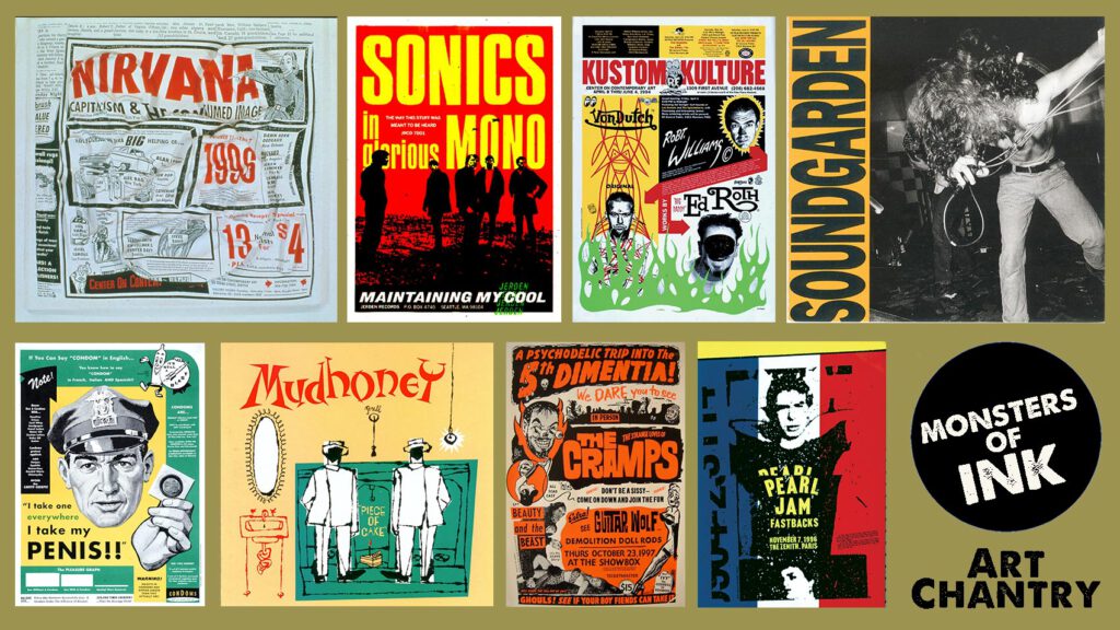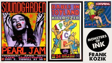
Monsters of Ink is a series where we talk to some of the artists and designers, both legends and legends-to-be, whose contributions ascribe the visual language of modern music.
ART CHANTRY…
moved to Seattle from nearby Tacoma in the late 1970s; “too old to be a punk, and too young to be a hippie.” Despite his birth year, he was drawn to the former; and after some time spent in the straight design world, he took a deep dive into making gig posters. During that period, the budding artist was also serving as the primary design force behind legendary local music rag the Rocket when two of that publication’s writers, Bruce Pavitt and Jonathan Poneman, decided it was high time they went into the record business. They expanded Pavitt’s “Sub Pop U.S.A.” column into a record label in 1986, and Chantry was among the talent poached from the magazine to help define Sub Pop’s iconic aesthetic.
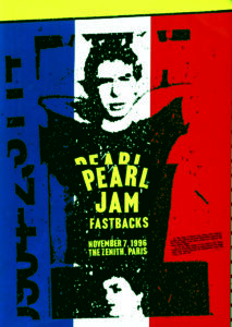
For Chantry, working for friends like Sub Pop and Estrus Records was more about taking part in a broader community than enhancing his own profile. He had no idea that his bag of analog tricks — bold, wild lettering, high-contrast photocopying, collage, ostensibly slapdash (but actually carefully considered) color registration — would come to be one of the most copied visual styles of the decade to come. If you close your eyes and try to picture what 1980s-90s Pacific Northwest rock (call it grunge, if you must; it’s all punk to Chantry) looked like, there’s a healthy chance you’re picturing something he designed.
Which Came First: Art or Rock ‘n’ Roll?
ART CHANTRY: I was born in 1954. I think that was the same year that Ike Turner’s “Rocket 88” was released, and also Bill Haley’s “Rock Around the Clock.” So, I think I am exactly as old as rock & roll. Pathetic, eh?
Just Another Seattle Punk
No, I was never in a band; these bands were my friends. The scene in Seattle was so terrifically small, that there was intense creative crossover among all artists of every kind: actors, musicians, painters, designers, models, writers, etc. Sure, there were cliques like anywhere — and often they didn’t mix. Despite this, the town was so small that you’d still run into each other every time you turned around.
In the late 1970s, I was fascinated by punk (I had a college degree in art), but I was too old to be a punk and too young to be a hippie. I was working to become a professional graphic designer. I didn’t fit into the age bracket above or below me. Everybody treated me as an outsider; they never really trusted me all that much.
I did mostly stuff for non-profits and arts people — a lot of theater posters, for instance. I also did corporate design for big corporations; but I love posters. That was my main focus, even though the poster scene in Seattle didn’t really include the rock scene all that much… because there wasn’t much of a scene at all. Record covers? Make me laugh. Even if you designed them, you couldn’t get them manufactured this side of Los Angeles. It was all printed through the mail.
I was doing records covers for the only record label in town (I looked it up in the phone book). Every graphic designer wants to do record covers, right? Me too, but it was a weird tax scam biz. I did covers for them overnight for a hundred bucks a pop. They’d give me an artist’s name and a song list. I did everything else, often including naming the record! I lost a whole year’s income when they crashed and burned in the very early 1980s. I did, however, get to design some covers for the Sonics! Even back then, they were my all-time favorite band.

So, I was thought of as a “serious professional” by the starving hipster crowd. When [legendary Seattle free paper] the Rocket hired me as art director, it was because nobody else really wanted to do the job, but that’s where I really began to meet and hang with musicians. The Rocket was the only kiosk in town — the hub of the music scene wheel. There was virtually zero money, but I got to do fun work. After that, I just stuck it out. It was work I could believe in.
“The Grunge Look”
The “grunge” thing did not begin in southern California (like academic design history narrative wants you to believe). In fact, grunge isn’t even a style: it’s a marketing term coined by Sub Pop’s Bruce Pavitt to sell punk music. Back then in Seattle, you couldn’t buy punk rock records in chain stores. You had to go to weird little strange punk record stores to find them. Peaches Records had an import section where they’d sell punk. So, if you wanted to buy a record by a Seattle band, you had to wait for it to get shipped to England, then shipped back as an “import.” Crazy, huh? But using the term “punk” was commercial poison at the time.
“Grunge” was when punk broke into the big time. Bruce Pavitt nailed it. He thought, if only he could change the perception, he could sell the music… and he was right. He worked at the Rocket, where he had a column called “Sub Pop U.S.A.” in which he reviewed all the little weird 45s that were too strange to review in our regular record reviews section. When he and Jonathan Poneman (who also wrote for the Rocket) started Sub Pop, he simply hired the designers working at the newspaper to design the covers. Community.
The design style at the Rocket was influenced by a series of amazing designers (some of whom went on to major careers elsewhere). By the time Sub Pop started up as a record label, the Rocket had been in business for over ten years. Sub Pop’s style was simply the Rocket style (as was everything else graphically that came out in the Seattle scene during that time). My ideas were a big part of the development of that style, so my style was also the Rocket style. So was everybody else’s who worked there. It was community.

For the Love of Trash…
Trash culture is American pop culture, and pop culture is created by subcultures. This is where shared graphic design language is created; then, it’s appropriated by mainstream culture. Underground cultures are a cauldron of invention and creation. I believe this so sincerely that I actually walked away from graphic design culture over 25 years ago. I literally turned my back on graphic design as an industry and career; I didn’t want to be a part of the language that is influenced by the popular culture, I wanted to be a part of the actual culture creating the new design languages.
It was an expensive sacrifice to make, but it worked. I devoted my time to helping this community in as many ways as I could (I donated my prime earning years); but I was able to put a spin on American graphic design that would have been impossible if I’d attempted to pursue a traditional design career.
Throwing Away Money
[EDITORS’ NOTE: The famous (at least, among nerds) scene in the film Hype! where Chantry takes a paper cutter and chops up posters for shows featuring bands that became popular — purportedly all quite valuable — is embedded, and then discussed, below.]
I was simply trying to point out that the stuff that’s precious and of value all begins as trash (“one man’s trash is another man’s treasure”). That poster I cut up has famous names on it; therefore, it was desirable to collectors who would pay big money for it. However, when it was actually printed years earlier, none of those bands were famous. They were the same nobodies you see on punk posters stapled to telephone poles in your hometown. It was the mainstreaming of Seattle punk culture (a.k.a. “grunge”) that made the poster a valuable object.
At the time Hype! was being filmed, I was living like a rat while others in Seattle were making millions. It was hilarious watching the international shark feeding frenzy over all the trash we’d been making. It became a joke. So, we all made witty little remarks about that — the whole subject of the film could be “too much, too soon.” It literally ended up with a lot of people dying, thus it was extremely ugly to see up close and personal. I was lucky to be a part of that culture explosion, but it’s something I don’t ever want to be a part of again.
By the way, like Mark Arm says in Hype!, “I may be dumb, but I’m not stupid.” That poster I cut up was a photocopy. I’d just sold the original to a collector for $400. The joke’s on you!
