Even though it’s never specified exactly what it is, over the past twenty-five years Hot Water Music has constantly been searching for…something. It’s easy to see it in the band’s music which, in its early days, was based upon the southern hardcore stomp of Avail, the rough-hewn songcraft of Leatherface, and the punchiness of Fuel, the East Bay punk band that would later have its name co-opted by an alterna-grunge group. And sure, in the ‘90s you could throw a rock and hit a band that claimed Avail or Leatherface as an influence, but not too many folks were fusing them together, taking hardcore and pop hooks, and making them feel united. However, there was an element to Hot Water Music’s approach that not only set it apart from its influences and allowed it to surpass its peers. The music was good, that’s to be sure, but few bands in its scene had the distinct visual aesthetic that would take its music to another level.
On its face, Hot Water Music is nothing more than an assemblage of four bearded southern dudes, the kind that, if they had grown their hair out, could have had passed for a sludge metal band like EyeHateGod. And while Hot Water Music is the product of these four guys—Chuck Ragan and Chris Wollard on vocals and guitars, bassist Jason Black and drummer George Rebelo—there’s a bigger ethos at play. From their simple yet effective logo, which has been plastered on body parts of the band and its fans alike, to the distinct visual sense implanted by visual artist Scott Sinclair upon their albums, singles, posters, and t-shirts, Hot Water Music has been able to maintain an element of esotericism that few other punk-leaning bands have been able to emulate.
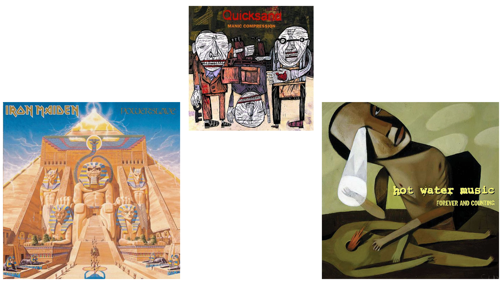
Much like how the band itself took scattered influences and stitched them together to make a sound of its own, Sinclair’s visual sense could be broken down in a similar manner. Similar to how Ragan and Wollard weren’t shy about the songwriters that they attempted to emulate, Sinclair has been just as forthright about his own influences. His work mixes the vibrant color palette of ‘80s skateboard decks, the vague menace of dystopian sci-fi like The Watchmen, the off-kilter artwork found on Quicksand album covers, and the lavish expanse of video games. But in his own attempt to mimic the art on Quicksand’s Manic Compression, he ended up creating a universe unique to the band for which he was painting.
In the same way that Derek Riggs’ deeply-detailed, otherworldly artwork would come to define Iron Maiden, Sinclair’s penchant for emotive fine art pieces would do the same for Hot Water Music. A single glance at the cover of Powerslave tells you everything you need to know about the music contained therein. It’s an epic flight of fancy, rich with evocative details and blink-and-you-miss-’em moments. The same can be said for Forever and Counting, Hot Water Music’s second album. Awash in dark greens, browns, and yellows, the artwork sees a character lingering over the body of a headless, fallen victim. As the central character stares upward in anguish, one eye is glaring back at its own hand, directly above the seemingly deceased character. The back cover, which appears to be a “before” shot, with the two about to come to blows, draws a circular narrative that’s reflected in the album’s contents. Not only that, this ever-permeable character found on the cover would become Hot Water Music’s version of Iron Maiden’s “Eddie,” an iconic character that seemingly changed his look from album to album.
The first line of the album sees Ragan bellowing, “Streamlined with all of that behind me,” before doubling back around to the fact that he’s been “too lost to see the way,” before giving it up and pursuing the truth. It’s a song about the cruel intricacies of existence, the compromises, the inner and outer battles, and the constant struggle to do more harm than good. You see it reflected in the illustration on the cover of Forever and Counting, and you see it time and again throughout the album, as Wollard and Ragan trade off lines in songs like “Just Don’t Say You Lost It” and in moody, heart-wrenchers like “Minno” and “Manual.” It’s a record that never tries to deal in absolutes, instead opting for the abstract, and Sinclair’s artwork evokes the same feeling. You may not know what they’re talking about, but you sure as hell feel it.
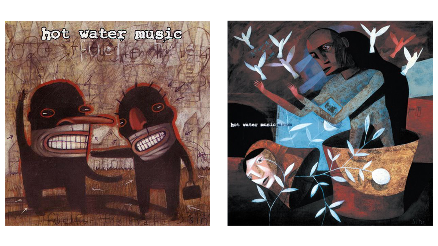 It’s these subtle, evocative images that allowed Hot Water Music to build a world that, while certainly influential, was ultimately unto itself. Fuel For The Hate Game’s cover can’t help but feel like a piece about the difficulty of work, survival, and compromise, with songs like “Freightliner” and “220 Years” tapping into that most directly. No Division sees Hot Water Music’s clay-looking character releasing doves, signaling a peace in the discord. It once again matches the record, as the band welcomed friends into the studio to contribute guest vocals—Avail’s Tim Barry, Discount’s Alison Mosshart, and Quicksand’s Walter Schreifels, who also produced the album, all make cameos—as the record establishes a general thesis surrounding unity. It’s not only in the album’s title, and baked into the title track itself, but “Our Own Way” and “It’s Hard To Know” may be the most life-affirming songs in a catalog that’s become rife with them.
It was during this period when we first started to really see fans plastering Hot Water Music’s instantly-recognizable logo on themselves. It’s hard to think of a show during that time where said logo wouldn’t make an appearance, be it on the back of a t-shirt or scratched into someone’s arm. Having come out of the hardcore scene, the band was boisterous and energetic enough to play alongside bands like Sick Of It All, but it had the pop sensibility to break into a shout-along chorus as well. By the early-2000s, Hot Water Music would make the leap to Epitaph Records, and as its sound streamlined, so too did Sinclair’s art, becoming more polished yet no less impactful.
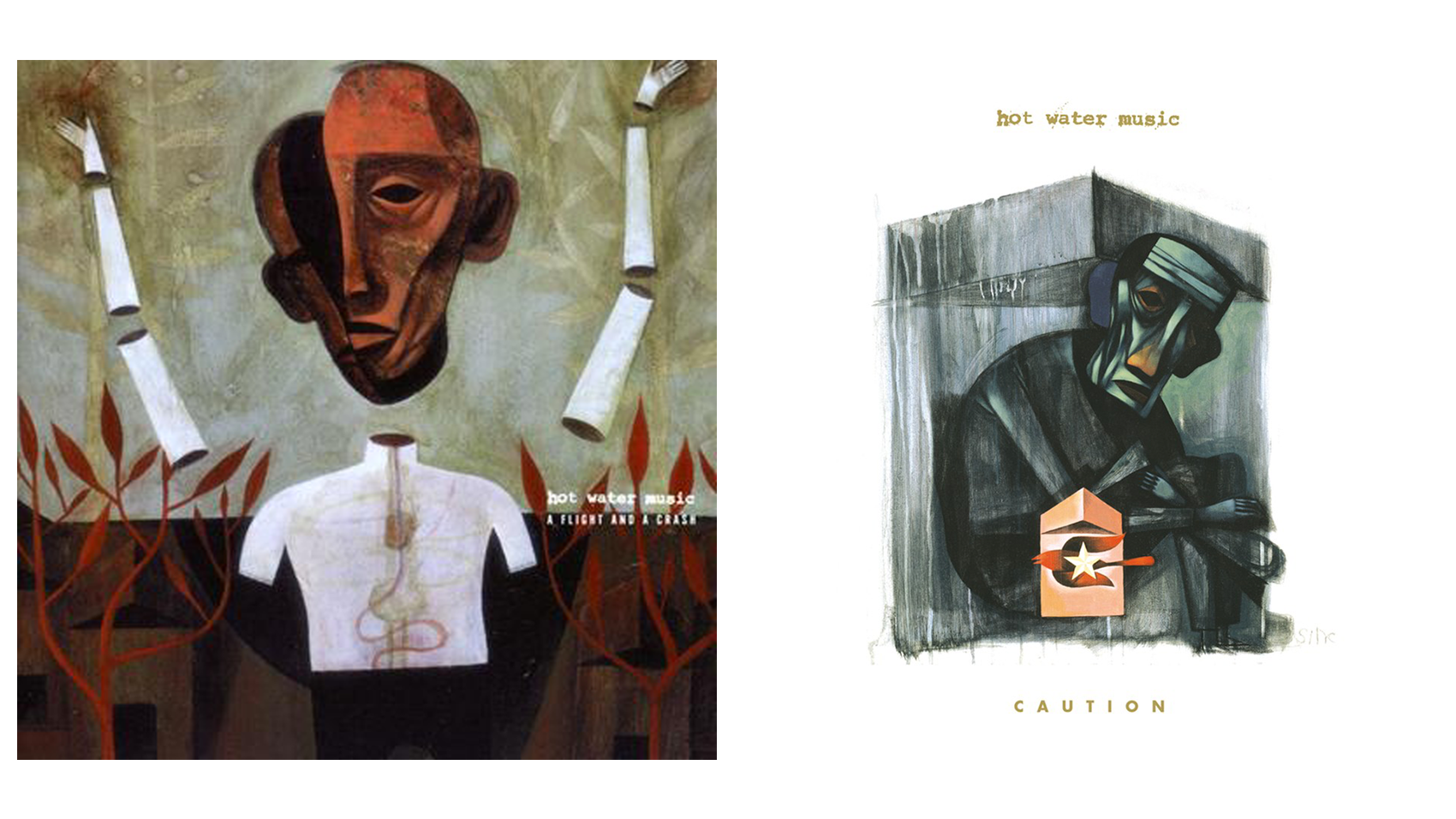 A Flight and A Crash and Caution both tell a story about the band’s place in the world. The former sees another abstract stand-in for the band being pulled in two different directions, on one side is its past and the other its future. The record wrestles with that, as it features the band’s poppiest tunes, while retaining the non-traditional song structures that typified much of its early years. Conversely, Caution is the tale of a band breaking free, shifting its sound and creating what is arguably its most well-known record in the process. On the album’s cover, another anguished character is shrinking itself inside a box, with a forlorn expression wisping across its face. But at dead center, there’s a bird and a star, symbolizing a way out as well as a path forward, one that Hot Water Music would end up taking.
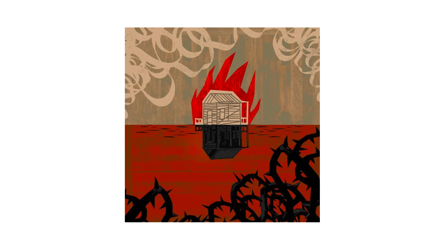 In 2017, Hot Water Music released Light It Up, a record that returns to Sinclair’s classic style of art and reflects yet another rebirth for the band. This union between band and artist may feel minor, but it’s become essential to the story of Hot Water Music. Though it can be argued that artwork, packaging, and the like means less and less in the digital age, it’s impossible to deny what it adds when paired in a meaningful way. Hot Water Music is a band that rose above its humble beginnings to become a touchstone in the worlds of both punk and hardcore, and Sinclair’s visual aesthetic pointed kids toward a more thoughtful, less slogan-filled version of what art could be as well. Together, Hot Water Music and Sinclair created worlds that were abstract and impressionistic, yet strangely familiar. And though punk has never fully embraced it, at least it’s got this sterling example.

