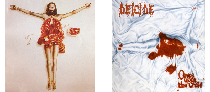
In 1985, Tipper Gore, her husband Al, and a handful of their fellow human buzzkills that made up the Parents Music Resource Center declared a handful of current pop songs the Filthy Fifteen, because they were simply too lewd for radio airplay. In addition to demonizing such occult anthems as “She Bop” by Cyndi Lauper and Def Leppard’s “High ‘n’ Dry,” the PMRC went on to eventually start demanding that any album containing naughty words adorn one of those lame parental advisory stickers (which only made us kids want that album more).
Señores y señoras have overwhelmingly pegged the PMRC as a bad thing, when in actually pleased the Gods of Irony by turning Tipper Gore—the former drummer of an all-girl band who happens to have one of the most metal surnames ever—into the face of modern censorship.
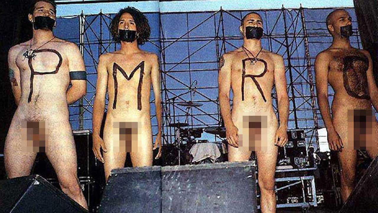
In heretofore polar opposites Dee Snider and John Denver, the PMRC gave us a superteam more powerful and impactful than anything in the MCU. And it prompted all four members of Rage Against the Machine to expose their “pockets full of shells” as part of an unforgettable silent protest at Philadelphia’s 1993 Lollapalooza stop.
While the majority of this unfortunate era produced a far less amusing, deeply unnecessary war between art and politics, it was hardly the first (or last) time that popular music has borne the brunt of the real world’s suckage—be it redneck radio refusing to play the Beatles after John Lennon boasted that his band was “bigger than Jesus,” a chorus of premium cable cretins scapegoating Marilyn Manson for Columbine, or even our current tendency to dub any art remotely divorced from a nebulous progressive doctrine “problematic.
Album covers have long been interpreted as the face of a musician’s intent, which is just part of the reason we extol the best of the best in our Monsters of Ink series. Plenty of those covers have frequently been subject to surgery from nervous record companies and big box retailers. Luckily, the record industry is dead, so worries going forward!
Not to mention, the would-be censors just don’t understand—if you’re gonna criticize something, criticize the actual art! It’s in that spirit that we examine the original and censored versions of five heavy album covers, and ask that most important of sartorial questions: Who wore it best?
Jane’s Addiction
Ritual De Lo Habitual (1990)
He co-created Lollapalooza. He fought to liberate Sudanese slaves, and physically extracted debris from post-Katrina New Orleans. Then, in his spare time, he gave the greatest television show in the history of the medium an anthem befitting its historic import.
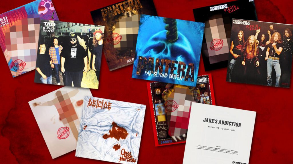
But perhaps Perry Farrell’s finest contribution to humanity is the cover to Jane’s 1990 sophomore sensation, Ritual de lo Habitual. It, Farrell projects himself totally naked, intertwined with two women—a nod to “Three Days,” a regrettably overlooked single from the album, whose release was sandwiched between eventual radio staples “Stop!” and “Been Caught Stealing.”
Much like its predecessor, Nothing’s Shocking (which spotlighted nude conjoined female twins), the original Ritual was a no-duh no-go for a variety of prudish retailers. Farrell responded in style, as the revised version features merely the band’s logo, the album title, and the first article of the First Amendment of the United States Constitution against a stark white backdrop (he added an entertaining, brief diatribe about Hitler, syphilis, and the potential advent of fascism in America on the back).
While that’s all pretty clever, there’s no comparison to the original, which effectively portends the brilliant, gonzo content within.
Scorpions
Virgin Killer (1976)
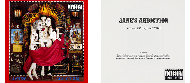
Gah. This is not, like, a grainy childhood Polaroid of a band member in a bubble bath, derping around with a toy tugboat. It’s a fully-nude 10-year-old girl in a highly sexualized pose, with broken glass superimposed over her genitals, an incredibly stupid attempt at provocation (“time is the virgin killer,” got it) that not even the most enlightened interview could explain away.
There’s surely a way to convey loss of innocence without triggering a delayed FBI investigation or exploiting the prepubescent relative of the photographer (yes, everyone’s at fault), and at least a few members are rightfully ashamed of this monstrosity. The Scorps were way better off doing the big dumb sex thing on the covers of Lovedrive and Animal Magnetism.
Virgin Killer’s replacement cover is basically a half-assed promo shot of the quintet, although almost anything would have been an improvement, including the boys putting themselves on the line and reenacting longtime worst-cover contender, Tino’s Por Primera Vez.
DEICIDE
ONCE UPON THE CROSS (1995)
One of death metal’s best qualities is how literal it can be. All you need in most cases is the band name and album title—the cover will usually be exactly what you expect, yet simultaneously more fucked up than you could possibly imagine. (See—or don’t—Gorgasm’s Stabwound Intercourse.)
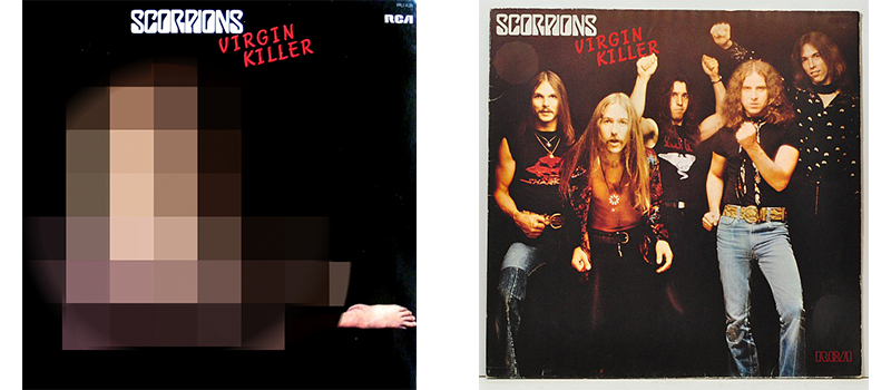
For Glen Benton and the Hoffman brothers’ third slab of Satanism, the band commissioned paraphilia-friendly U.K. artist Trevor Brown, and he came up with two gems. The first Cross cover was a disquietingly cold, clinical, In Utero-esque rendering of a disemboweled Jesus, zero reaction to his innards spilling everywhere.
Roadrunner, envisioning a distro nightmare, had second thoughts, and opted for an alternate version in which the Son of God is totally concealed beneath what looks like a hospital blanket (actually the Shroud of Turin), bled out, only identifiable by the iconic crucifixion pose.
Still cool, as it takes a second to grasp what’s going on, but subtlety isn’t always the answer in this genre—the original is too unreal and arresting to be denied.
PANTERA
FAR BEYOND DRIVEN (1994)
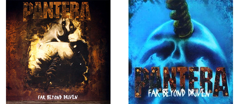
You don’t have to be a 40-Year-Old Virgin fan to appreciate the merits of “butthole pleasures.”If you’re a metalhead, you can get your fix not only with the pre-reissue cover of Type O Negative’s Origin of the Feces (depicting the dearly departed Peter Steele’s spread butt cheeks), but the original version of Pantera’s 1994 world-beater Far Beyond Driven, which goes the extra nine (inches) and features a drill bit grinding where the sun don’t shine. The official version takes the “safe” route, said drill bit merely boring into a human skull.
This is a pretty easy decision—the original is (appropriately) muddy brown, blurry, and hard to make out. If you hadn’t read this paragraph and never saw it, your reaction would probably be, “Wait, what is th… oh. OH. EW. Eh… whatever.” The gunmetal blue of the replacement is way classier—long the hallmark of this band.
TAD
8-WAY SANTA (1991)
This went down a lot like the Virgin Killer controversy—offending cover replaced with uninspired full-band shot—but the proto-grunge outfit unfairly suffered far worse repercussions than the Scorpions ever did. The original is a relatively innocuous found photo of a random 70s hippie copping a feel of his bikini-top-clad wife’s right breast.
Unfortunately, as bassist Kurt Danielson told Decibel in 2015, “The woman in the photograph had stopped into a Tower Records in Seattle and discovered the album. She was shocked and dismayed. She got a hold of her ex-husband … they had both become born again Christians. We had neglected to get them to sign a model release form.”
Long, tragic story short, Sub Pop had no choice but to pull 8-Way Santa, and Tad had to tour with no album to support, a devastating financial blow. Yeah, both band and label fucked up by not dotting the i’s and crossing the t’s, but the original is a harmless bit of dumb fun that exuded a lyrics-appropriate psychedelic vibe. It’s the clear winner.
Moral of story: Unless your name is Bob Pollard, never use anything you find in a thrift store for art. Some humorless old bastards will crawl out of the woodwork and bankrupt you.
